361 by FINCA, Case Study
Transforming micro finance in sub-Saharan Africa through an offline-first, CRO-centric digital platform
Project type: Micro Finance, Fintech, B2C
Role: Senior Product Designer (Consultant), Ikigai DigitalResponsibilities: End-to-end design ownership, user research (in-person + remote in Malawi), journey mapping, UX strategy, UI design, design system creation, branding, cross-functional leadership, design mentorship.
Tools: Figma, Miro, Jira, Confluence
Executive Summary:
361 by FINCA is an offline-first microfinance platform designed to modernise last-mile banking in sub-Saharan Africa by empowering Client Relationship Officers (CROs) with reliable, human-centred digital tools.
Led end-to-end product design across multiple squads as Senior Product Designer (Consultant), from discovery and UX strategy to UI, branding, and delivery
Conducted deep ethnographic research in Malawi to understand offline constraints, CRO workflows, and trust barriers in low-connectivity environments
Designed a fully offline-capable Android tablet app enabling CROs to onboard customers, capture KYC, and assess loans in the field
Validated architecture and usability through a Steel Thread pilot before progressing to MVP development
Eliminated paper-based processes, reducing loan turnaround time from 5–10 days to under 2 days
Increased renewal conversion rates from 20% to 70% through streamlined, guided workflows
Shifted operations from branch-centric to CRO-centric, increasing reach into remote communities and reducing operating costs
Delivered measurable impact while building a flexible foundation for FINCA’s long-term financial inclusion strategy
Introduction
“We’re building a new fintech platform that is fast, flexible, and deeply connected to people’s lives,” said Herman Spruit, CEO, 361 by FINCA. “With 361, powered by Thought Machine’s technology, we can create innovative, personalized financial products that grow with people’s lives—whether saving for school, starting a business, or supporting their families.” (Source FINCA, May) 2022
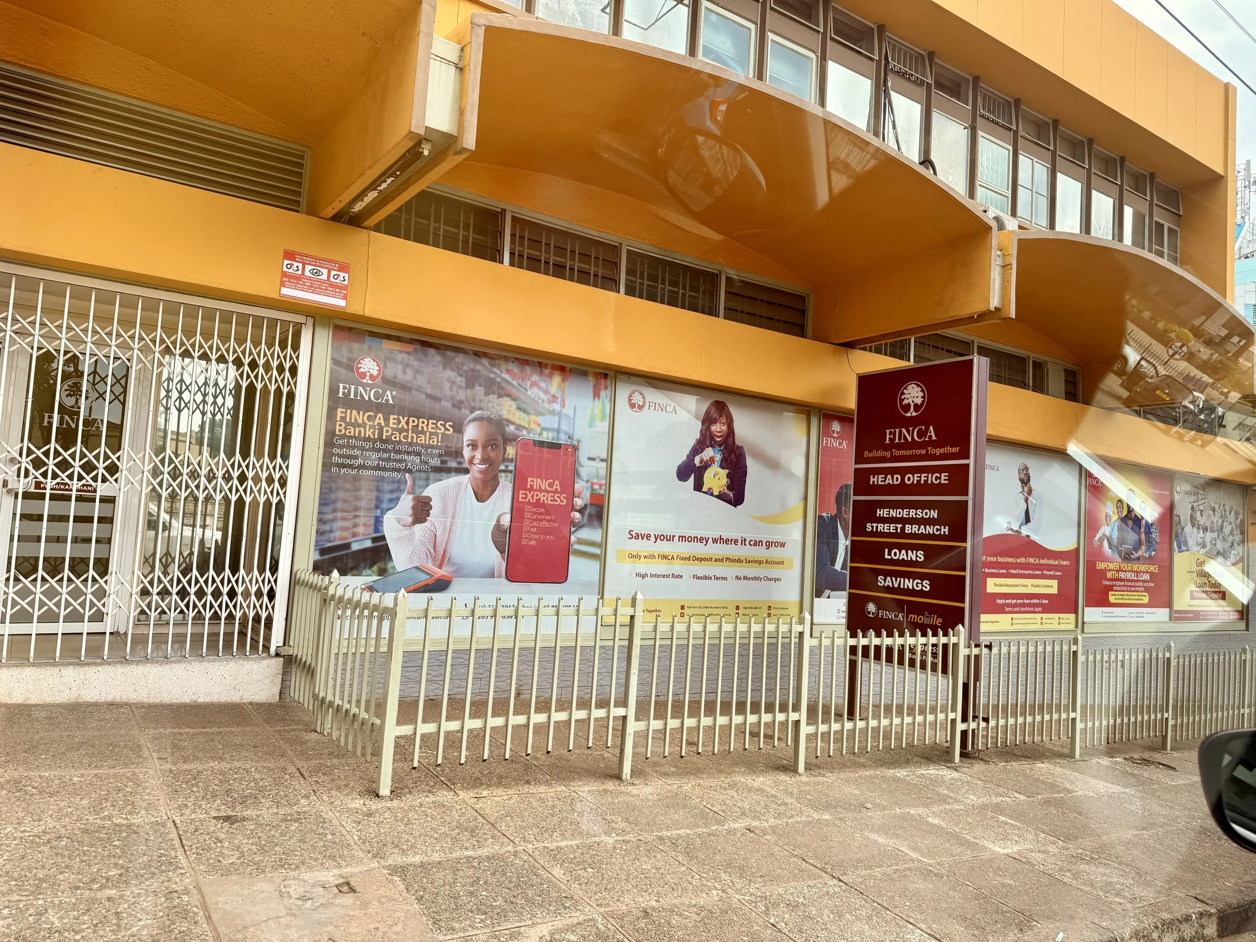
FINCA Malawi HQ, Blantyre
Ikigai, a boutique Financial Services consultancy, partnered with FINCA to build 361 by FINCA, a next-generation microfinance operating platform designed to improve financial health for low-income customers, beginning in Africa. Powered by Thought Machine’s Vault Core, the platform aims to shift MFIs from legacy, paper-heavy operations to high-tech yet human-centred models.
I was brought in by Ikigai as a Senior Product Designer, functioning as a guild across 7 bounded contexts squads, actively involved with 4 squads as UX/UI lead to help deliver a scalable, whitelabel Android tablet app for our main user: Client Relationship Officers (CROs).
CROs are the backbone of FINCA’s last-mile engagement model. They travel to remote communities, onboard new customers, assess loans, and manage relationships face-to-face. Our challenge was to design a completely offline-capable onboarding and loan application journey end-to-end, in a market where connectivity is unreliable and workflows are manually intensive.
Design Thinking Approach
1. Empathise — Understanding the reality in Malawi
To design effectively in a context fundamentally different from Western fintech, a deep discovery phase was conducted. Rounds of workshop sessions with FINCA 361 partners and stakeholders, including rounds of ethnographic research in Malawi.
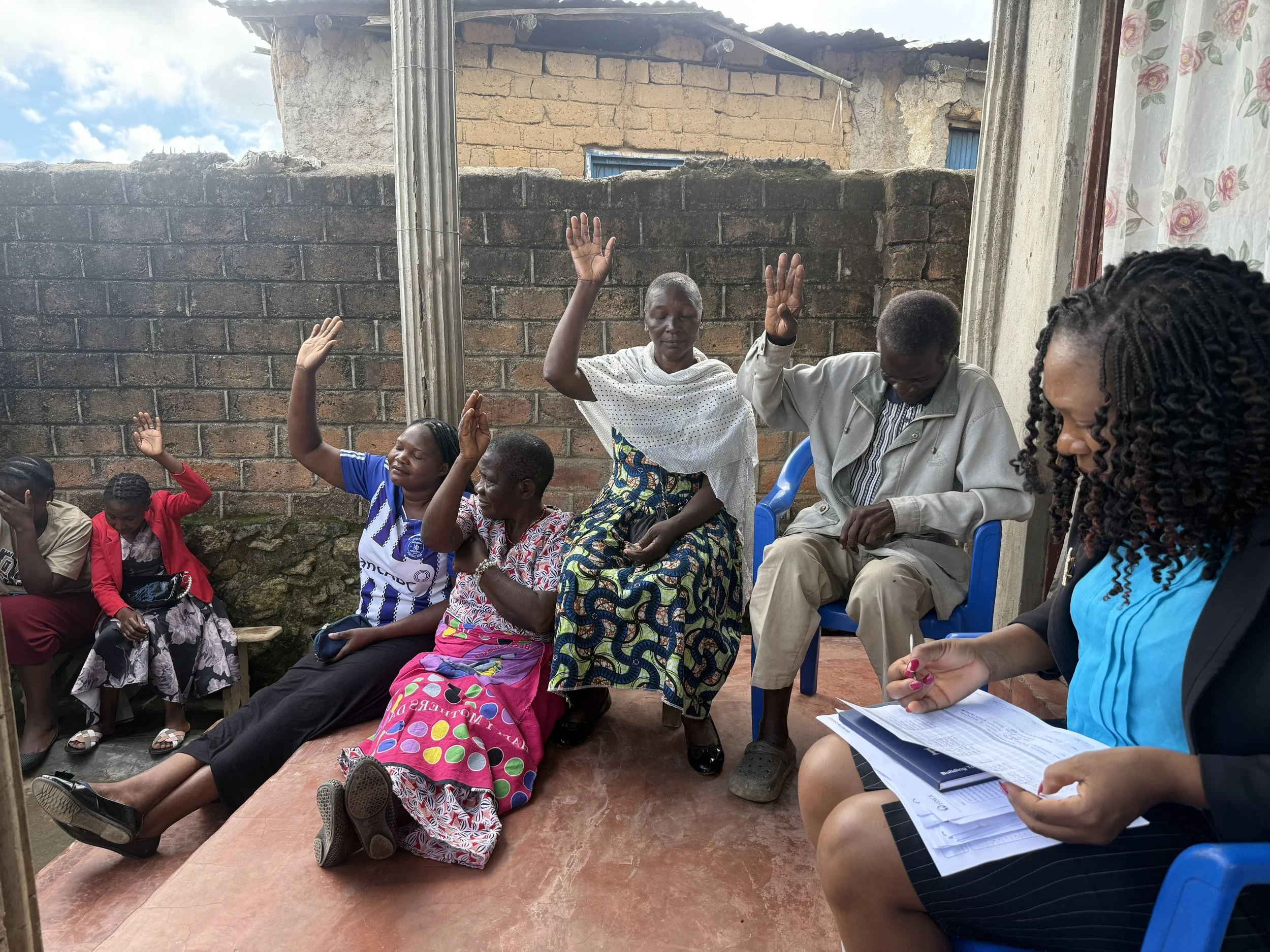
Blind voting during Group loan renewal in Malawi
Methods used during research included:
In-person contextual inquiry with CROs in urban and rural branches
Shadowing CRO journeys end to end
Remote interviews with product owners and Malawi operational teams
Cross-functional workshops with Ikigai, FINCA, and Thought Machine
Process walkthroughs and artefact studies of existing paper-based workflows
In-depth competitor analysis and market benchmarking
Key insights
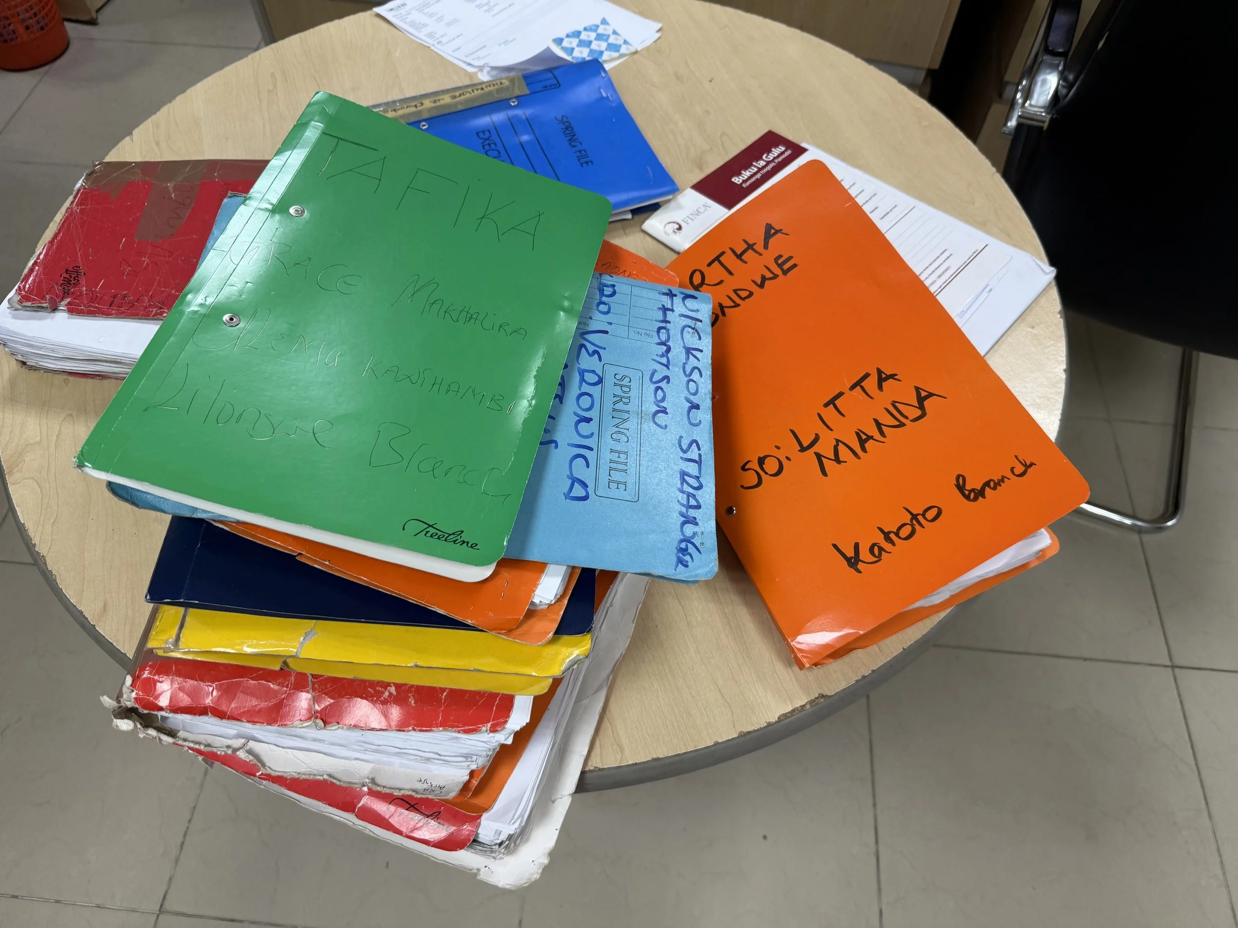
The entire process is heavily paper based
1. Connectivity is unpredictable and frequently absent
Every critical workflow must function end-to-end offline, including loan assessments, KYC, and data capture.
2. CROs are stretched thin
Some manage hundreds of customers and travel full days carrying backpacks filled with paper forms.
3. Customers have complex financial lives
Many clients, including smallholder farmers, micro-entrepreneurs, and women’s savings groups, deal with seasonal income, unpredictable cash flows, and limited digital literacy.
4. The branch is no longer the centre of gravity
CROs are the operational engine, and the product must support a CRO-centric model rather than a branch-centric one.
5. Process inefficiency prevents scale
Manual data collection, handwritten forms, duplication, and repeat visits reduce productivity and increase operational risk.
6. Trust is foundational to adoption
For the platform to succeed, both CROs and customers needed to trust it. Many CROs had previously been let down by unreliable or poorly implemented technology, which led to scepticism toward new digital tools. This meant the product had to be consistently reliable, especially in offline scenarios, communicate system status clearly, and behave predictably at all times. Above all, it had to genuinely support CROs in their day-to-day work, proving its value through usability, accuracy, and dependability rather than promises alone..
These insights formed the foundation for reframing the problem.
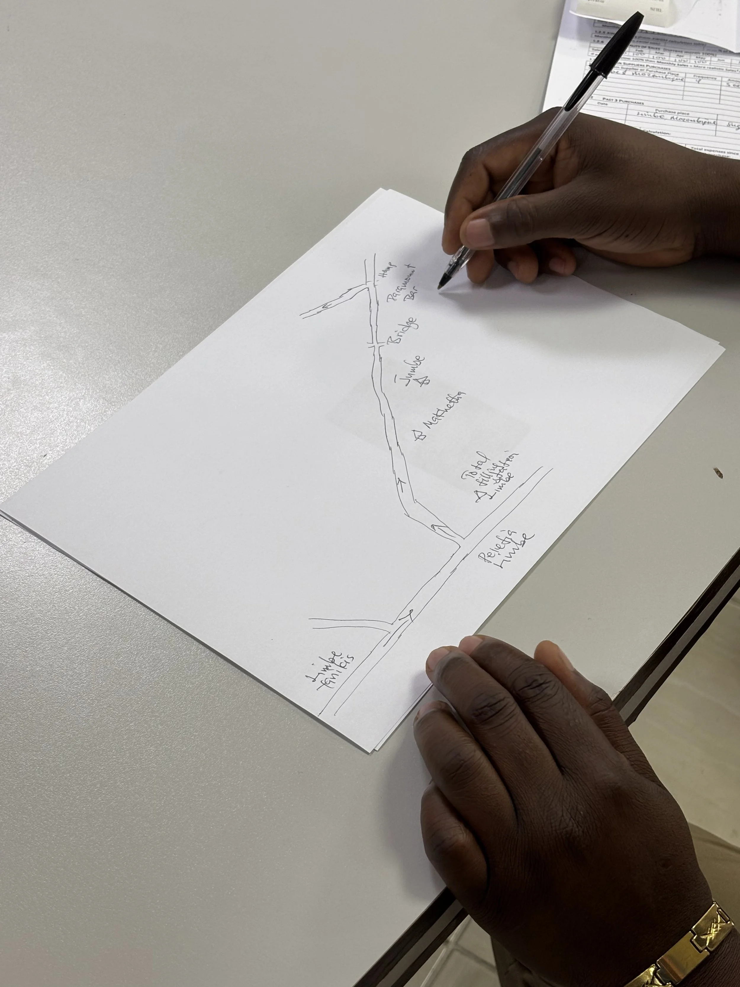
A CRO draws out a customer’s location on a piece of paper, in the FINCA branch, Limbe
User Personas
To align the team around real user needs, I created four primary personas representing the core roles within the microfinance ecosystem: the Client Relationship Officer (CRO), the Call Centre Representative, the Branch Manager, and Joyce, the FINCA ‘mission customer’.
The CRO persona was the primary focus, reflecting their role as the frontline operator responsible for onboarding customers, assessing loans, and managing relationships in often offline, high-pressure field conditions.
The Call Centre Representative persona captured the needs of support teams handling follow-ups, issue resolution, and customer queries, requiring clear visibility into customer status and system confidence.
The Branch Manager persona represented oversight and accountability, with a need for reliable data, consistency across CRO activity, and confidence in operational controls.
Joyce, the mission customer, represented low-income entrepreneurs and smallholder farmers navigating complex financial lives, limited digital access, and variable income. Including Joyce ensured that product decisions supported trust, clarity, and dignity in customer interactions, even when the primary interface was used by CROs on their behalf.
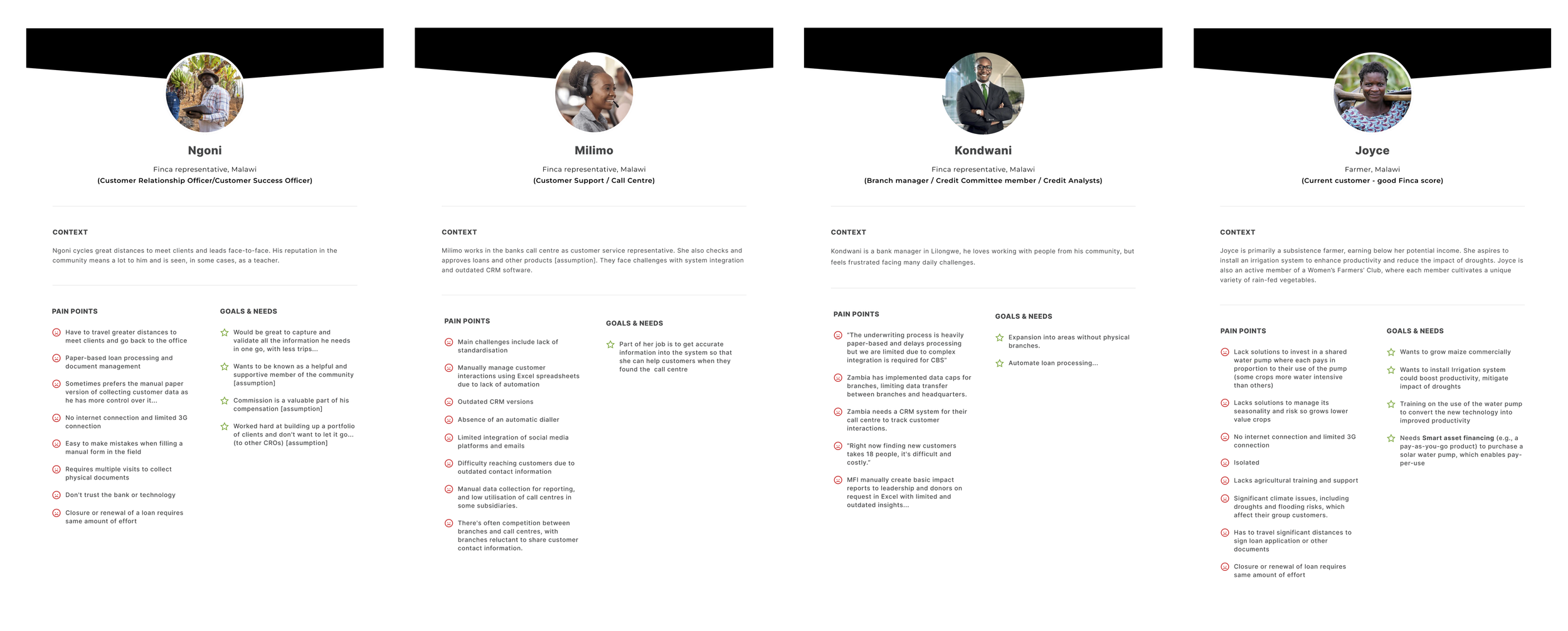
Personas with their pain-points and needs
2. Define: Reframing the challenges
The Telpo 450, a robust Android device that would be our launch hardware
The brief was not just to digitise microfinance in sub-Saharan Africa, but to completely revolutionise the way micro finance has been operating. By offering a new way to create a 360° view of customers to better understand their financial health needs at scale and offer personalised 1-to-1 solutions to improve their livelihoods and build resilience.
The problem was that to begin to achieve this, we first had to digitise the disjointed process FINCA Malawi was using, streamline it, and then build on it.
Core problem statement:
How might we enable CROs in Malawi to onboard customers and process loans fully offline, at scale, and with improved productivity, while maintaining trust, accuracy, and operational compliance?
Project constraints
Must work offline, with seamless data sync when connectivity is available
CROs have variable levels of digital literacy
Processes must remain compliant yet simple
Hardware constraints included Android tablets with inconsistent reliability
Multiple stakeholders across continents with differing priorities
Today’s micro-finance processes are expensive, slow and cumbersome for MFI staff and customers:
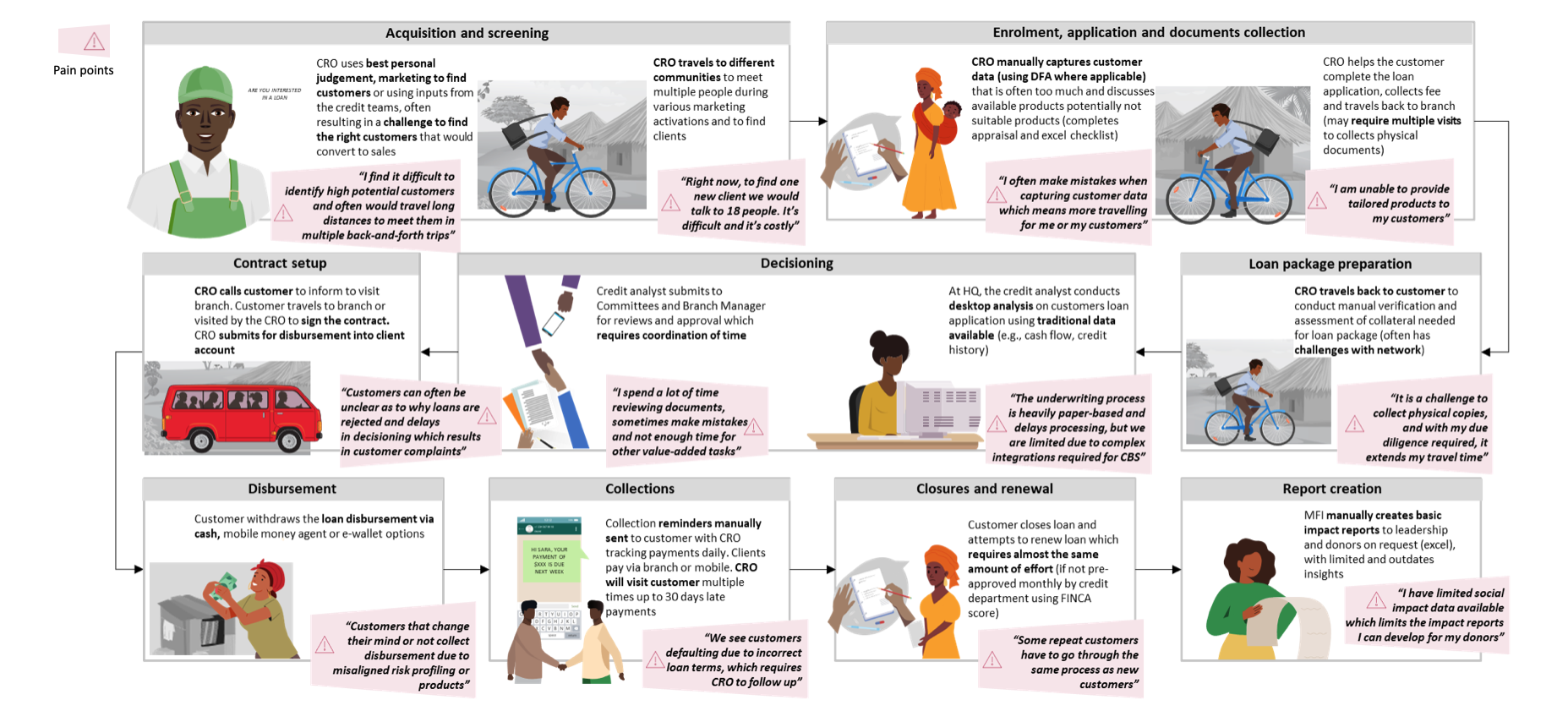
User journey map and pain points of the current problem space
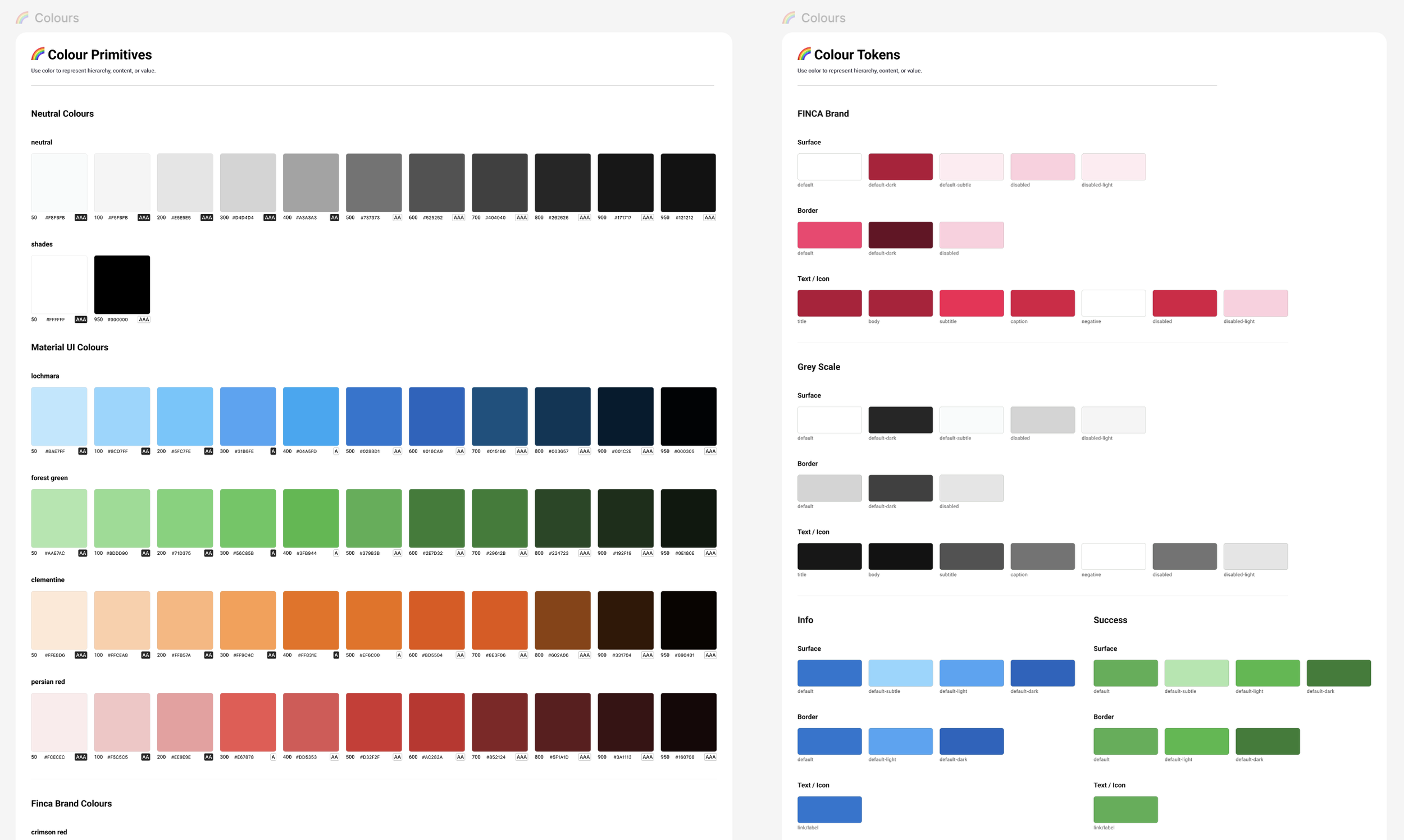
Colour pallet from my Design System, to aid scaleability and simplicity
Design Principles
I created the following Design Principles as guidance for our design and development process, which I co-created in a workshop-style presentation with senior FINCA stakeholders.
1. Design with empathy
Put people first, including CROs, internal teams, and mission customers. Design with a deep understanding of users’ emotional, physical, and technical realities, prioritising accessibility, inclusivity, and real-world constraints.
2. Simplicity with purpose
Focus on what matters most. Reduce complexity, minimise cognitive load, and create intuitive experiences that require little explanation, especially for users with varying levels of digital literacy.
3. Consistency builds trust
Use familiar language and patterns to create clarity and confidence. Where variation is necessary, ensure experiences remain cohesive and predictable, particularly in offline and low-connectivity scenarios.
4. Iterate and learn
Continuously prototype, test, and refine. Combine qualitative insights with data where available to validate decisions and improve outcomes over time.
5. Design for the future
Build flexible, scalable foundations that support growth, adaptation, and long-term impact across products, markets, and communities.
Steel Thread and MVP
The project began with a Steel Thread release, a thin end-to-end slice of core functionality designed to validate the system architecture and prove the concept in real conditions. Following a successful Steel Thread, we progressed to MVP development. The Steel Thread was deployed to a small pilot group of CROs in the Blantyre and Limbe branches, where we continued to test, learn, and iterate based on real-world use.
3. Ideate: Co-creating the future CRO experience
I partnered closely with product owners, Malawi operations, engineers, and stakeholders to ideate new workflows and user journeys.
Ideation activities included
In-depth, Event Storming sessions with key stakeholders, which included assumption mapping to identify risks in offline workflows
Crazy Eights brainstorming and ideation session with the Malawi Product team and Product Owners
Journey mapping workshops across onboarding and loan renewal
Co-creation sessions with CROs, virtually and in person
Prioritisation using MoSCoW and value versus effort mapping with POs
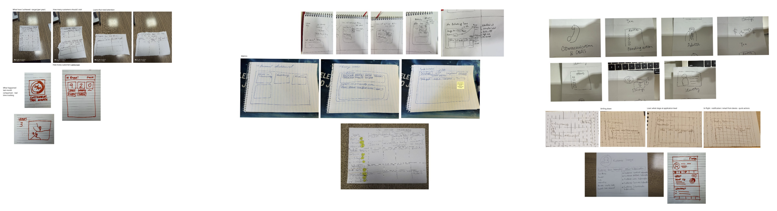
Crazy Eights ideation session with Malawi Product team and Product Owners
Key concepts generated - Steel Thread
Guided offline KYC capture, including photos, ID data, and signatures
A configurable form engine to support evolving loan products. Onboarding and loan application forms could be changed and uploaded via a config file, without needing re-deployment of the application.
All data captured will be stored on the device if the user doesn’t have connectivity, in a ‘back-end for front-end’ database. Data will then automatically be uploaded to the server backend once the user has connectivity.
MVP and future scope
A unified CRO dashboard to manage daily tasks, visits, and customer pipelines
Map and route planning
Automated risk flags to improve assessment consistency
Call Centre web application to manage soft collections
Reimagining Group Loans
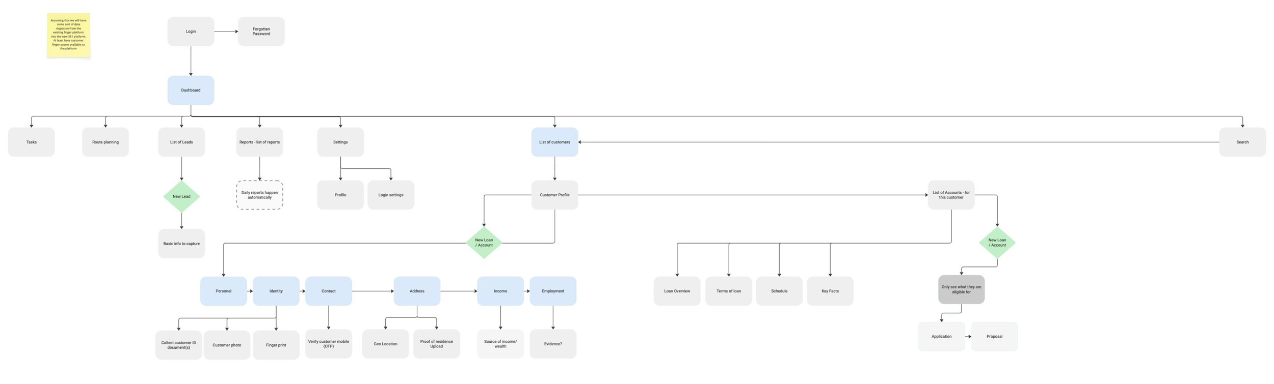
CRO App Information Architecture
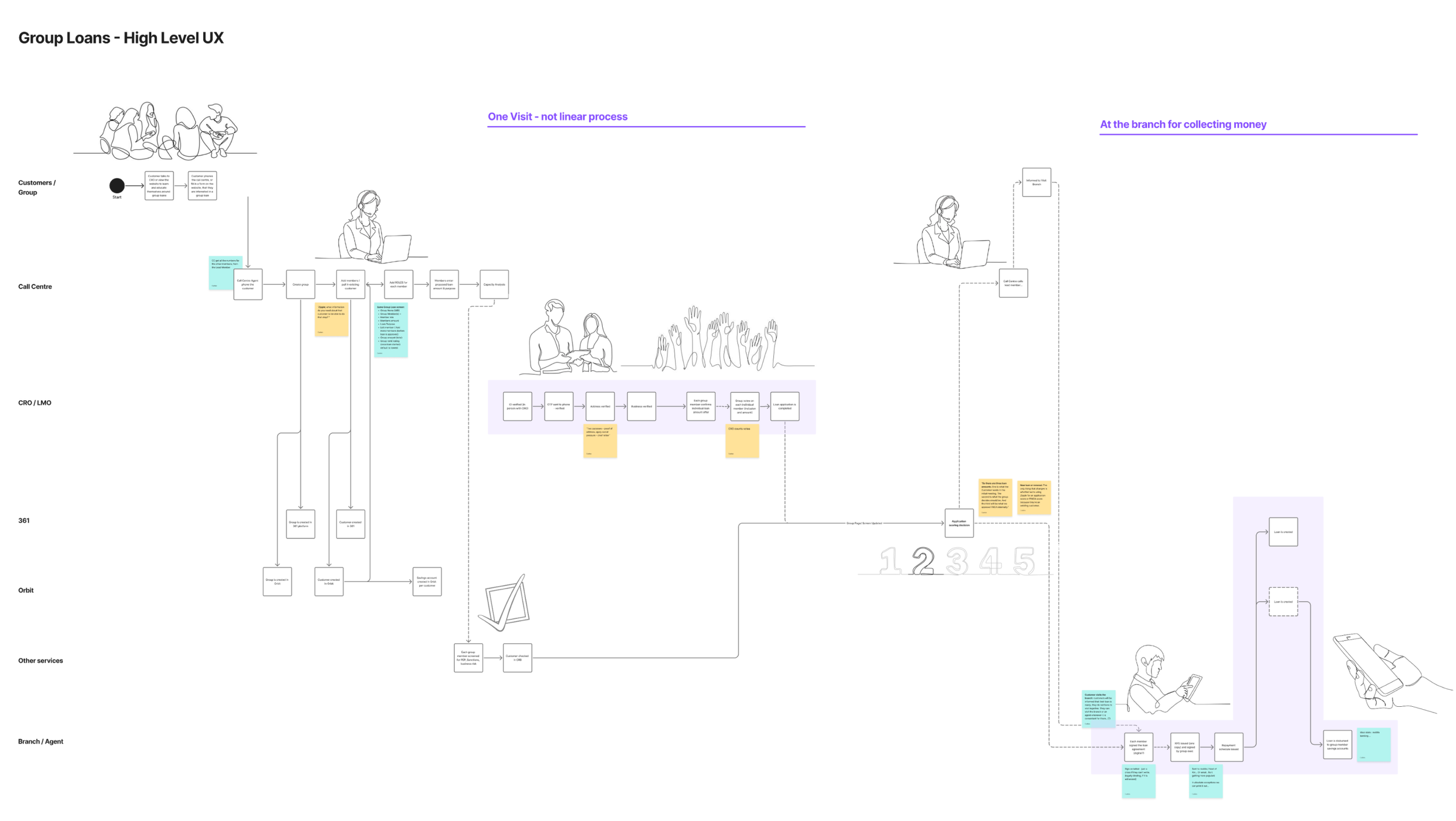
End-to-end Group Loans user journey - showing how we can reduce the amount of visits a CRO will have to perform, from between 5-10 to 1 visit!
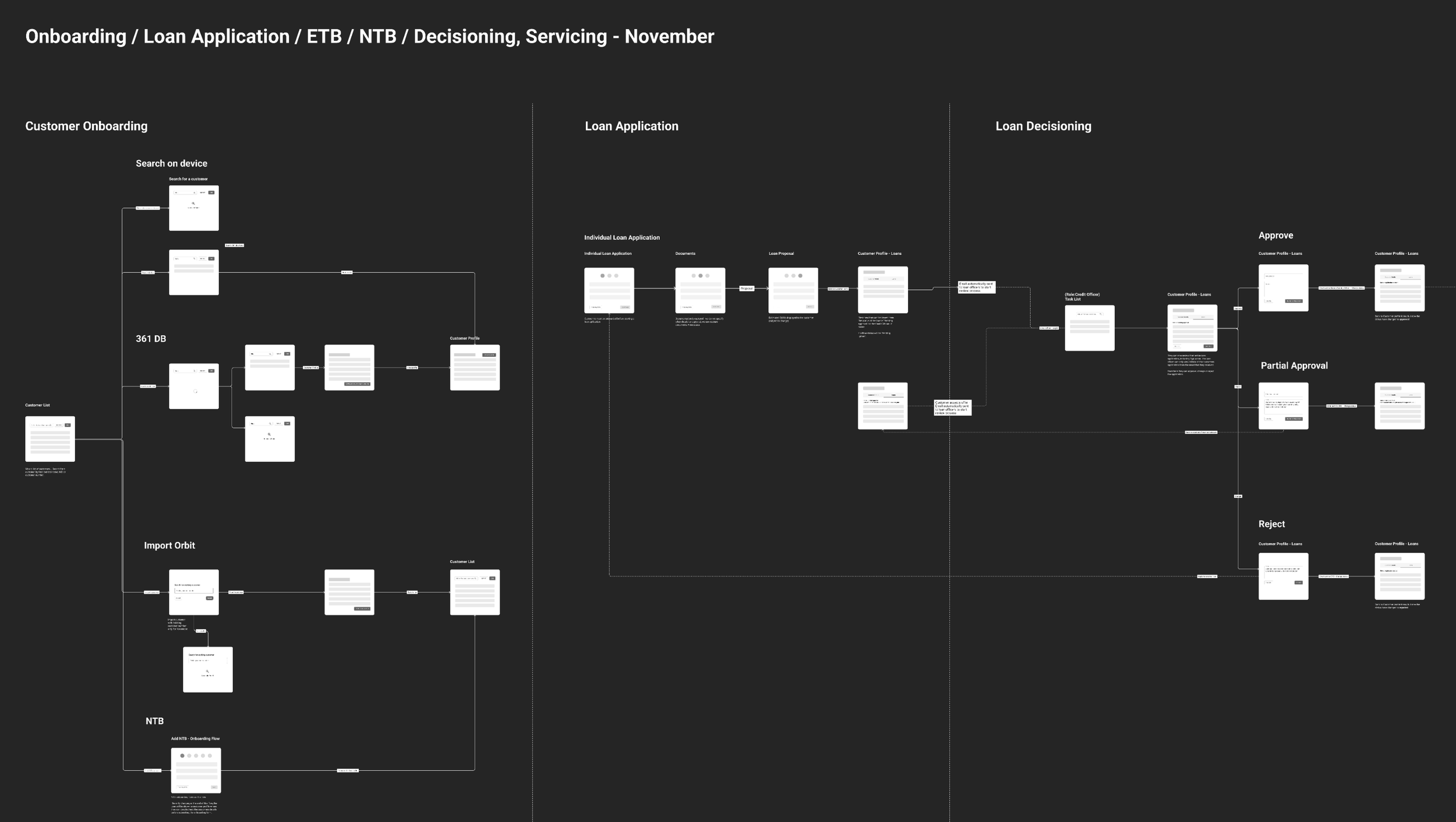
High level UX - Onboarding and loan application user flow for ‘new to bank‘ and ‘existing to bank’ customers
4. Prototype: Bringing it to life
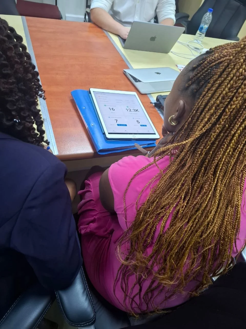
Live prototype testing with CROs in Malawi
On top of writing a comprehensive research and testing plan, which I continuously revised and communicated with the team and client stakeholders, I created iterative prototypes in Figma and tested them continuously with CROs and internal teams.
What was tested
Step clarity in onboarding and loan assessment journeys
Real-world usability, common when CROs are standing in the field, i.e. one-hand form filling and accessibility when in full sun exposure
Cognitive load in form-heavy workflows
Offline-state comprehension, including confirmation that data was saved or synced
CRO confidence and trust in digital workflows versus paper
Key learnings
CROs needed explicit reassurance of form submission, such as “Form Pending” or “Form Synced”
Large touch zones and minimal text were essential, especially in outdoor environments
Flat information architecture reduced task completion time significantly
CROs valued quick exits back to the dashboard when customer interactions were interrupted
These learnings directly informed the final UX.
Concepts tested with high-fidelity wireframes
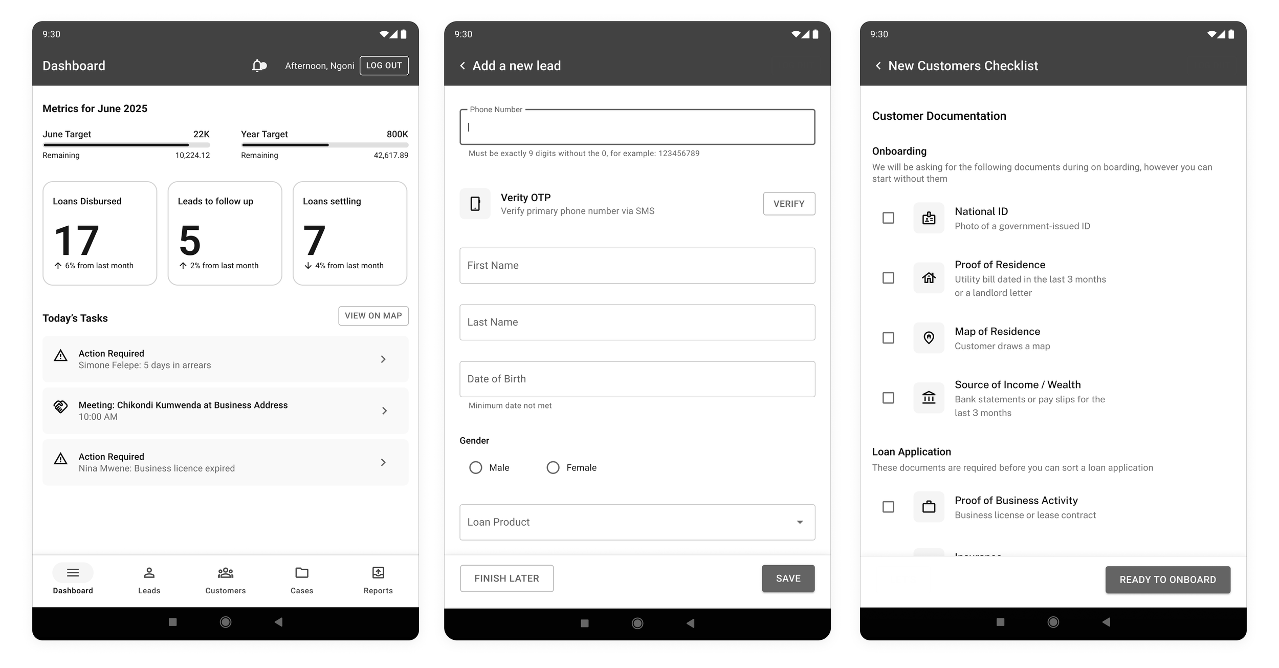
CRO Dashboard: A centralised dashboard providing visibility of key performance metrics, upcoming tasks, and a map view to support daily planning, prioritisation, and efficient field visits.
Lead Capture Form: A streamlined lead capture flow enabling CROs to quickly record essential customer information and verify phone numbers via OTP. This significantly improves data quality and reduces downstream issues caused by incomplete or inaccurate information.
Customer Preparation Checklist: A clear, easy-to-understand checklist outlining what customers need to bring to their meeting with a CRO. This enables full data capture and allows the loan application process to begin in a single visit, reducing repeat travel and friction for both CROs and customers.
High-fidelity wireframes
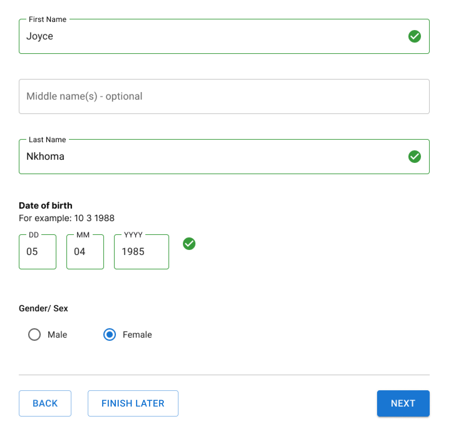
Separate number fields with full labels: This research, which tested a number of iterations with a range of actual live users, concluded that just having three separate number fields, with text labels assigned was the most usable pattern for humans.
Accessibility and inclusive design
Accessibility was a core consideration throughout the design process, shaped by the realities of the operating environment and the diverse needs of CROs and customers.
CROs work in bright outdoor conditions, often for long periods, and with varying levels of digital literacy. To support this, the interface was designed with high contrast colour palettes, large touch targets, and a clear typographic hierarchy to ensure readability in sunlight and ease of use on tablets. Complex interactions were deliberately avoided in favour of simple, guided flows that reduce cognitive load and the risk of error.
Language was kept clear and instructional rather than technical, helping CROs confidently explain steps to customers during in-person interactions. Accessibility decisions were therefore not treated as compliance requirements alone, but as essential design choices that improved usability, trust, and adoption in real-world field conditions.
5. Test: Continuous validation with end users
Testing was continuous throughout the project lifecycle.

Discussing key connects using high fidelity wireframes, with the Malawi product team.
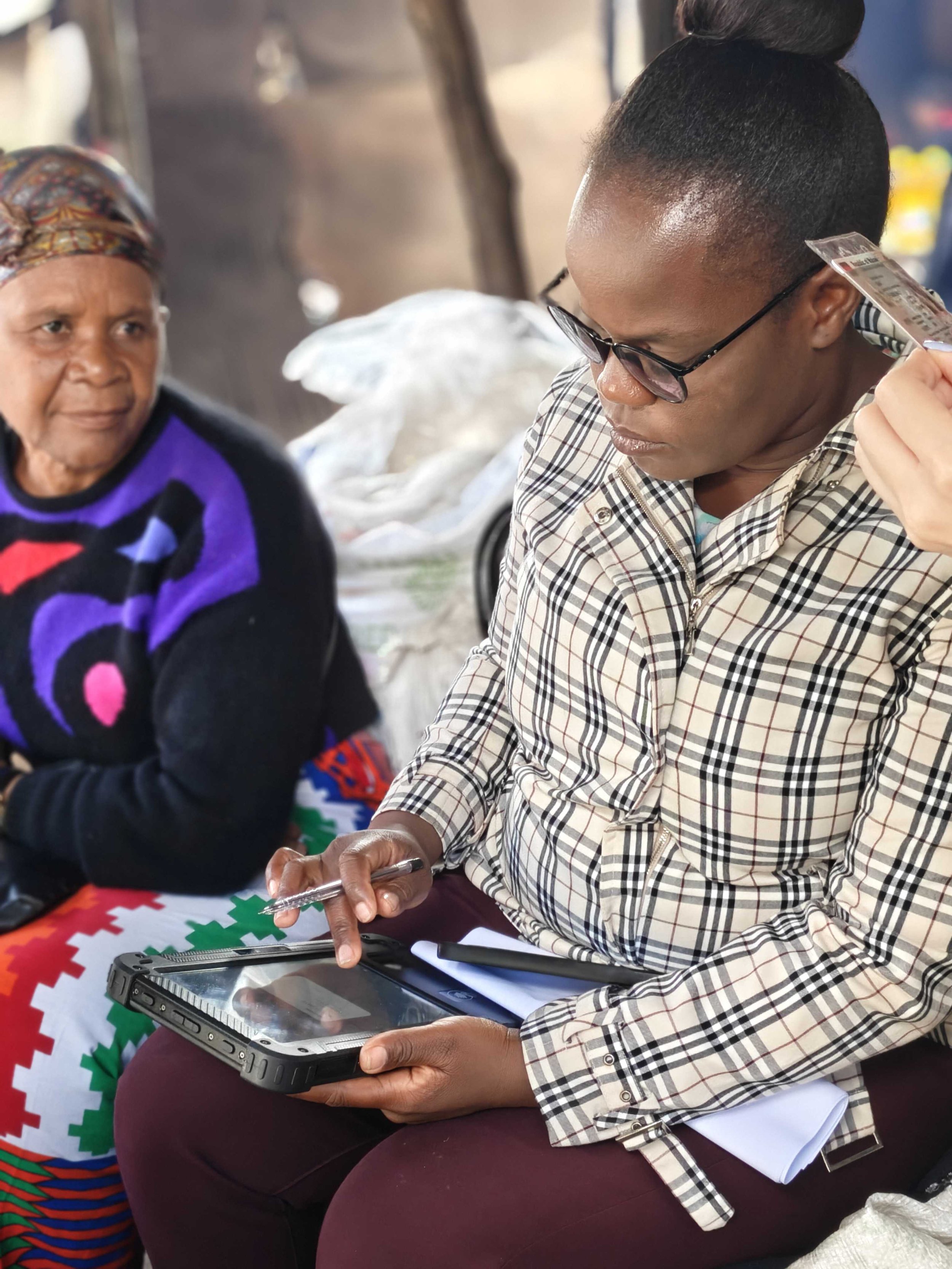
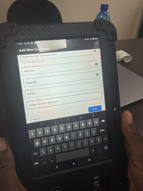
Steel Thread launch in Malawi, CRO entering a customer’s details
Steel Thread usability testing
We tested the first fully integrated workflow to validate offline data capture, sync reliability, and CRO comprehension.
Moderated usability testing
Sessions were conducted with CROs across multiple Malawi branches, focusing on:
KYC capture
End-to-end loan applications
Error handling and edge cases
Real-world device and connectivity constraints
I also created a feedback form for CROs to fill in, in order to gather honest, unfiltered, and candid insights from users
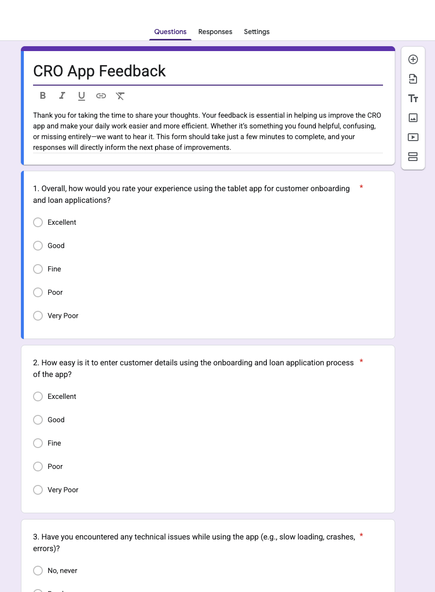
CRO Feedback from
Business and technical validation
Regular reviews were held with:
FINCA operations teams
Credit risk and compliance
Thought Machine engineers
Ikigai solution architects
Improvements made through iteration
We dramatically reduced the KYC flow input fields, focusing on entering the right information at the right time
Consolidated redundant loan application fields
Added contextual helper text to reduce CRO uncertainty
Onboarding Flow (Steel Thread)
Delivered as part of the Steel Thread deployment, enabling CROs to complete the core onboarding journey end-to-end.
Offline photo capture: CROs can capture and store customer photos directly on the device, with images securely uploaded once connectivity is available.
Digital signature capture: Customer signatures are captured directly on the device, removing the need for printed paperwork and manual processing.
In-flow document capture: CROs can attach documents or take photos as they progress through the onboarding form, ensuring all required information is captured during a single customer visit.
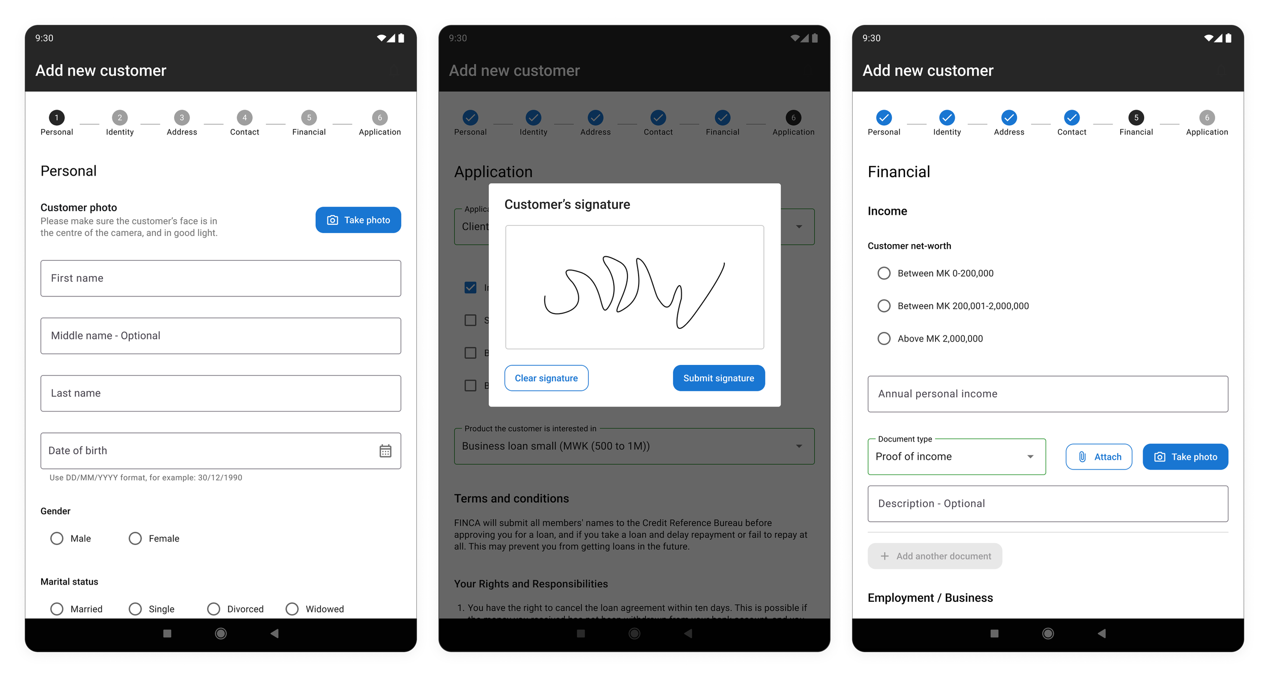
Onboarding Flow (Steel Thread)
Outcomes and Impact
1. Fully offline-capable CRO tablet app
Delivered the first scalable Android tablet application enabling CROs to onboard customers, capture KYC, assess loans, and manage pipelines entirely offline.
2. Operational efficiency gains
Reduced administrative time for CROs
Conversion rate for FINCA score 1 & 2 renewals 70% (from 20%)
Loan TAT <= 2 working days from application completion to disbursement (down from 5-10 days)
Onboarding of new customers in minutes (decreased from several days)
Fewer errors compared to manual paper processes
Increased consistency in credit assessment
Eliminate all paperwork in the onboarding and loan application process
3. Shift from branch-centric to CRO-centric operations
The new platform enables MFIs to reduce dependency on physical branches, resulting in:
More customers served per CRO
Lower operating costs
Greater reach into remote communities
4. Scalable design system and UX foundation
For the steel thread, we used Material UI as the Design System, which is ideal for Android and fast development. Alongside MUI, I established a basic yet reusable design system that supports white labelling, new products, and rapid rollout across multiple African markets.
5. Cross-functional leadership and mentorship
As a delivery lead, I:
Mentored a mid-level designer
Aligned product, engineering, operations, and credit teams
Ensured design quality and consistency across work-streams
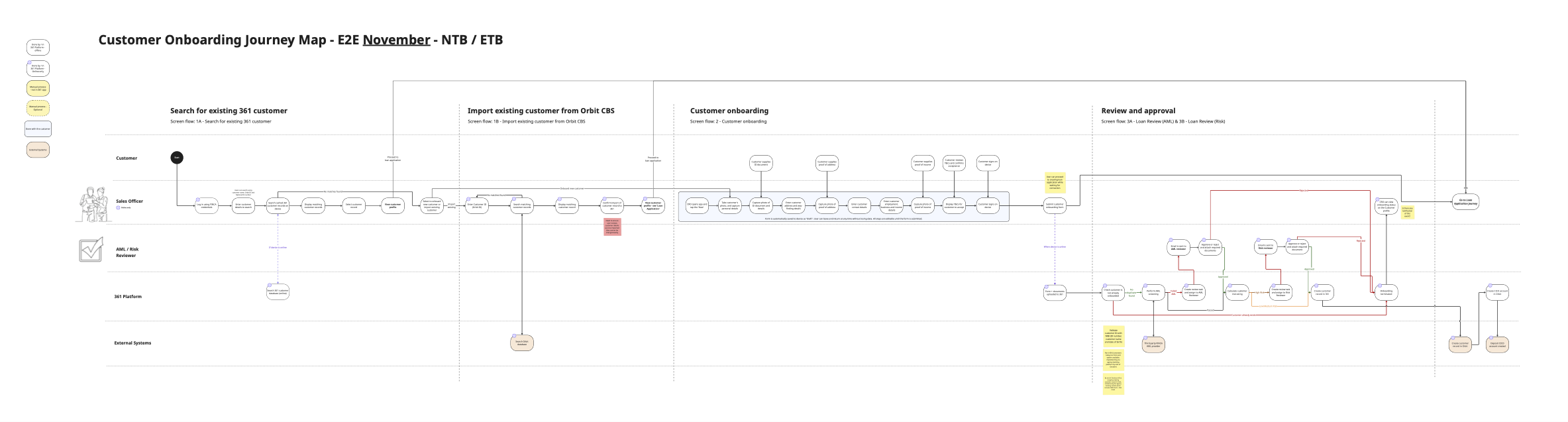
Journey map and process flow for Malawi December launch - these were instrumental in handing over to Malawi teams, to understand how the platform works
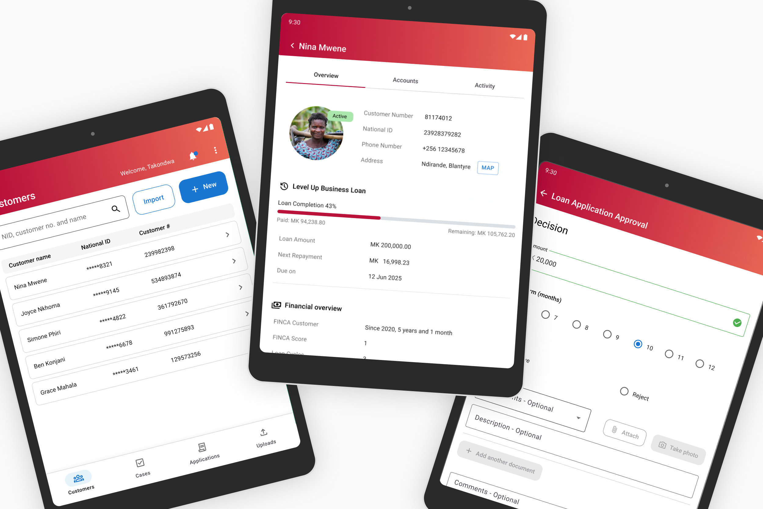
MVP User Interface - with FINCA Brand
Designed and delivered an MVP UI aligned with FINCA brand guidelines to ensure familiarity and trust for internal users.
Secure authentication: Users authenticate using their FINCA Microsoft credentials, providing a secure and seamless login experience.
Customer search and local Save: CROs can search across both 361 and FINCA databases to find existing customers and save selected profiles locally on the device for offline use.
Upload status management: A dedicated upload screen provides clear visibility into form and data upload statuses, giving users confidence that information has been successfully saved or is pending sync.
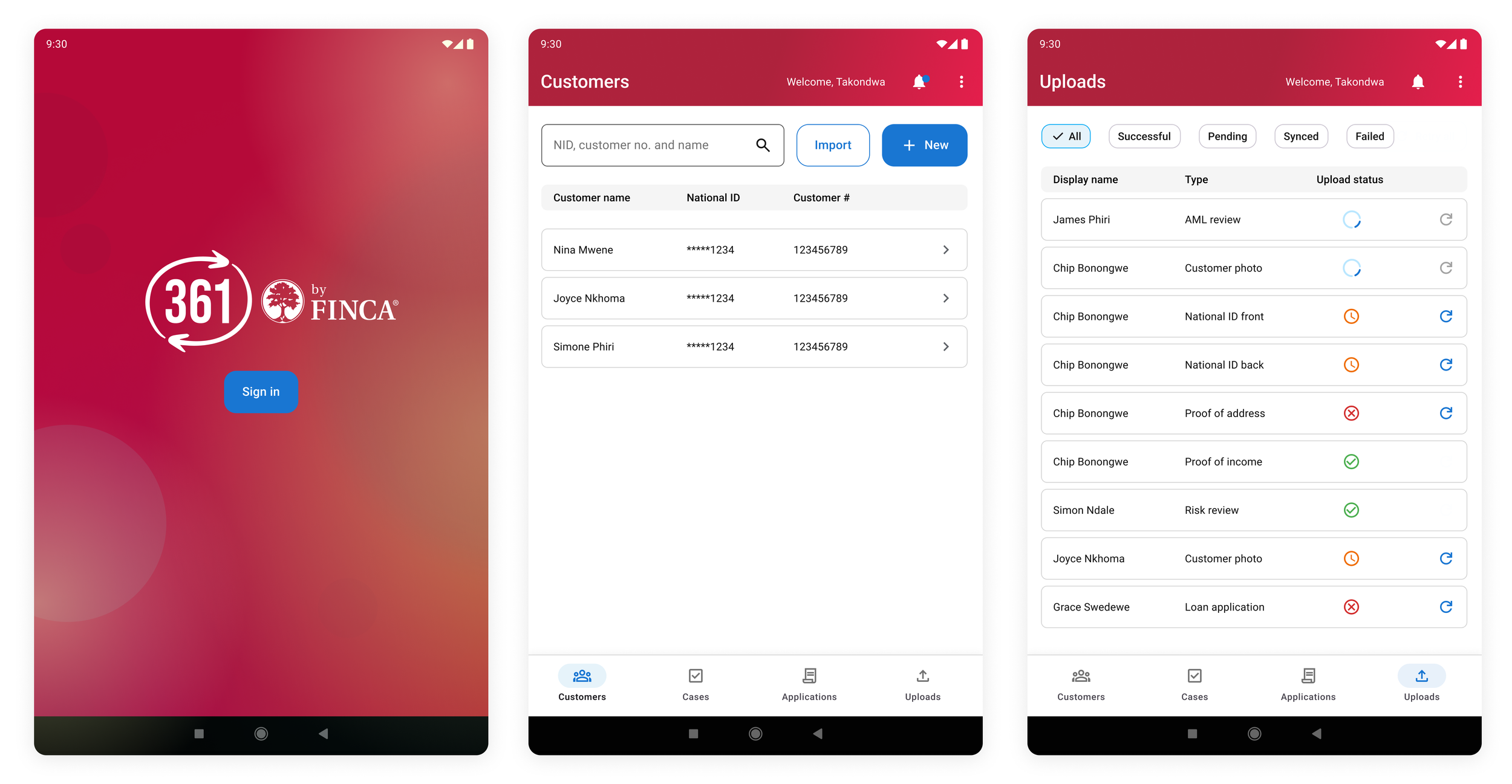
MVP UI with FINCA Brand
Conclusion
The 361 by FINCA project required designing for an environment where technology cannot be taken for granted. By grounding decisions in deep user research, offline-first thinking, and continuous validation, we delivered a digital experience capable of transforming micro finance operations at scale.
The platform supports FINCA’s mission to enable low-income customers, including farmers, micro-entrepreneurs, and women’s groups, to build financial resilience and economic opportunity.
By redesigning the CRO workflow, we strengthened the human relationships at the heart of micro finance while equipping teams with tools designed for the future.
Testimonial
“I was deeply impressed by her drive, knowledge of the design world and deep compassion for both users and peers alike.”
I worked with Carien for 9 months on the Finca by 361 project. I was deeply impressed by her drive, knowledge of the design world and deep compassion for both users and peers alike. Carien demonstrated clear ability to drive both design and product decisions in an unfamiliar space and a willingness to learn and think outside of the box to solve incredibly complex problems in a very unorthodox problem space. I would strongly recommend Carien for any design, prototyping and UI/UX roles.
- Lead Architect for 361 project, ikigai - Tati Kmita, 28 Nov 2025